


In today’s visual-first digital world, design is no longer decoration — it’s communication.
Before anyone reads a word of your website, email, or ad, they’ve already made a decision — often in less than 0.05 seconds (Google Research). That judgment? It’s almost entirely based on visual perception.
That’s the power of the psychology of visual content — understanding how the brain interprets color, contrast, layout, and imagery to create emotional reactions and shape decisions.
Design doesn’t just make content look good. It determines whether people trust, engage with, and buy from your brand.
Why Visual Psychology Matters in Marketing
Over 90% of information transmitted to the brain is visual, and people process visuals 60,000 times faster than text (3M Research).
In other words, your visuals speak before your words do.
That’s why the brands that master visual storytelling — from Apple to Canva — dominate attention and conversions.
Visual design isn’t just about creativity; it’s about cognitive influence.
Every shape, color, and image sends subconscious signals that affect trust, emotion, and action.
The Psychology of First Impressions

Humans are hardwired to make snap judgments.
According to Stanford University, 94% of first impressions about a brand’s credibility come from design.
That means your homepage layout, typography, and color scheme determine how trustworthy your business appears — before your audience reads a single headline.
Good design says, “You can trust us.”
Poor design says, “Proceed with caution.”
Visual trust is the first conversion step.
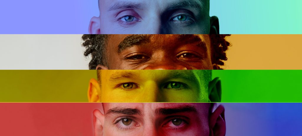
The Role of Color Psychology in Marketing

Color isn’t aesthetic — it’s emotional language.
Each hue triggers psychological associations based on culture, experience, and instinct.
Color Meanings and Effects
| Color | Emotion Triggered | Common Use in Branding |
| Blue | Trust, stability, calm | Finance, tech, healthcare |
| Red | Passion, energy, urgency | Food, retail, entertainment |
| Yellow | Optimism, creativity, warmth | Travel, lifestyle, e-commerce |
| Green | Growth, balance, wellness | Sustainability, health, finance |
| Black | Sophistication, authority | Luxury, fashion, tech |
| White | Simplicity, purity, space | Minimalist, clean design |
| Orange | Excitement, friendliness | Sports, entertainment |
| Purple | Creativity, luxury, spirituality | Beauty, education, wellness |
Example: Coca-Cola uses red for energy and excitement, while PayPal uses blue for trust and stability.
Consistency in color builds brand recognition — studies show color increases brand recall by up to 80% (University of Loyola).
Shapes, Space, and Subconscious Design

Beyond color, shapes and spatial arrangements also trigger emotion and behavior.
- Circles suggest community, harmony, and unity (used by Google and Target).
- Squares and Rectangles convey structure, balance, and stability (used by Microsoft).
- Triangles imply direction, power, and motion (used by Adobe).
Whitespace (negative space) is equally powerful — it creates focus, calm, and clarity.
A cluttered page triggers cognitive fatigue. A balanced layout helps users relax, process, and act.
The Cognitive Science of Visual Attention

Marketers often fight for attention — but psychology explains how to guide it.
Eye-tracking studies reveal people scan pages in F-patterns (left-to-right, top-to-bottom).
That’s why:
- Headlines should sit top-left.
- CTAs (calls to action) should be visually distinct and centrally aligned.
- Faces and directional cues (like arrows) help guide the eye toward key content.
Use contrast to emphasize hierarchy. Bright buttons on muted backgrounds attract focus instantly.
Attention isn’t captured by accident — it’s designed.
Emotional Design: How Visuals Influence Feeling

Every great design starts with an emotion.
When your visuals evoke joy, safety, or excitement, users connect subconsciously before they think consciously.
Example:
- A wellness brand uses soft greens and curved lines to communicate calm.
- A fitness brand uses bold typography and red highlights to inspire energy.
Emotional design activates the limbic system, the brain’s emotional center — directly influencing purchasing behavior.
According to HBR, emotion accounts for over 70% of buying decisions.
Visual Storytelling: Turning Data Into Emotion

Visual storytelling transforms abstract ideas into experiences.
Use visuals to show transformation — not just information.
Example:
A before-and-after graphic of “manual process vs. automated workflow” communicates the benefit of your GoHighLevel CRM system far better than paragraphs of text.
Good visuals reduce cognitive load — they make ideas easy to grasp.
When customers see themselves in your story visually, they feel emotionally aligned with your brand.
The Power of Consistent Visual Branding

Consistency builds memory. Memory builds trust.
When your social posts, website, and emails share the same tone, color, and aesthetic, your audience instantly recognizes your brand.
According to Lucidpress, consistent branding increases revenue by up to 23%.
Create a unified visual identity by defining:
- Color palette
- Typography system
- Iconography
- Image style (photography vs. illustration)
- Brand grid and spacing system
Tools like Canva Brand Kit or Frontify make it easy to maintain visual harmony across all campaigns.
Visual Trust Cues That Increase Conversions
Trust is visual.
Here are design elements that instantly increase credibility:
- Professional imagery — avoid overused stock photos.
- Testimonials with faces — human faces increase empathy and recall.
- Visible contact info and social proof — signals accountability.
- Data visualization — graphs communicate authority quickly.
- Security badges and certifications — ease subconscious skepticism.
When design reduces doubt, conversion rates rise.
The Role of Motion and Video

In 2025, static content is giving way to micro-motion — subtle animations, hover effects, and looping clips that draw attention.
Motion triggers curiosity and improves retention.
Short-form videos (like Instagram Reels and YouTube Shorts) are particularly effective for emotional connection.
Use motion intentionally:
- Animate transitions for smoother UX.
- Add explainer loops for product pages.
- Use scroll-based motion to enhance storytelling.
But avoid excess — too much motion increases cognitive stress.
Accessibility: The Overlooked Aspect of Visual Psychology

Design that excludes is design that fails.
Accessible design isn’t just ethical; it’s psychologically inclusive.
Follow the Web Content Accessibility Guidelines (WCAG):
- Ensure sufficient color contrast.
- Add alt text to images.
- Use readable font sizes and line spacing.
- Avoid flashing elements that may trigger discomfort.
Accessibility enhances emotional comfort — and expands your audience reach.
Applying Visual Psychology Across Platforms

1. Websites
Use clear hierarchies, calming colors, and whitespace.
Highlight one primary CTA per page — clarity increases conversions.
2. Email Marketing
Design with visual flow:
- Header → Message → CTA.
- Use branded colors and imagery to make emails instantly recognizable.
Example: With GoHighLevel CRM, automate branded email templates that reinforce color consistency and trust.
3. Social Media
Use the 80/20 visual rule — 80% engaging visuals, 20% copy.
Keep designs clean, legible, and emotion-driven.
Platforms like Canva or Adobe Express simplify brand-aligned visual creation.
4. Advertising
Leverage contrast and white space for clarity.
High-contrast ads (e.g., bright CTA on muted background) outperform cluttered designs by up to 40%.
The Neuroscience of Conversion Design

Conversion design works by guiding the eye toward the next desired action — naturally and subconsciously.
Three key principles:
- Visual Hierarchy: Use scale and contrast to prioritize key elements.
- Gestalt Principles: Group related content visually to make it intuitive.
- Cognitive Fluency: The easier your design is to process, the more credible it feels.
When your design “feels right,” it’s often because your brain finds it easy to understand.
The Balance Between Creativity and Clarity

While creativity attracts, clarity converts.
Brands often over-design — adding too much flair at the expense of usability.
The goal of visual psychology isn’t to impress; it’s to influence.
Ask before publishing:
- Does this design make the message clearer?
- Does it feel aligned with our emotional goal?
- Can a new visitor understand the story in 5 seconds?
If yes — you’ve designed with psychology, not ego.
The Future of Visual Marketing in 2025 and Beyond

The next wave of visual marketing will merge aesthetics with AI, emotion, and interactivity.
Emerging trends include:
- AI-Generated Visuals: Tools like Midjourney and Runway ML creating personalized brand assets.
- Dynamic Branding: Logos and layouts that adapt to user context.
- Data-Driven Design: Real-time visuals adjusting based on analytics.
- Neuro-Design Testing: Eye-tracking and brainwave studies optimizing design for engagement.
The future belongs to brands that balance design precision with emotional depth.
FAQs
Q1: What is the psychology of visual content?
It’s the study of how design elements like color, shape, and layout influence perception and decision-making.
Q2: Why is visual psychology important for marketing?
Because design shapes emotion, trust, and user behavior subconsciously.
Q3: Can small businesses use design psychology effectively?
Absolutely. Even simple design improvements can increase engagement and conversions.
Q4: What colors convert best?
There’s no universal rule — it depends on your audience and emotion goal. Test and iterate.
Q5: How does visual consistency impact branding?
It builds recognition and trust by making your brand instantly familiar.
Q6: What tools help with visual storytelling?
Canva, Adobe Express, Figma, and GoHighLevel’s visual automation builder.
Q7: How does accessibility fit into visual psychology?
Inclusive design creates comfort and trust by respecting all users.
Design isn’t just what your brand looks like — it’s how it feels to your audience.
When you apply the psychology of visual content, you move from decoration to direction — turning visuals into experiences that drive emotion and action.
Great design converts not because it’s beautiful, but because it’s believable.
If you’d like expert help crafting visually persuasive campaigns powered by automation and human-centered design, our team can help.
With GoHighLevel CRM—available for under $50/month—you can automate visually branded campaigns, maintain consistency across channels, and deliver design-driven marketing that actually converts.
Design with psychology. Market with emotion. Convert with trust.
Start Building Smarter Visual Campaigns