


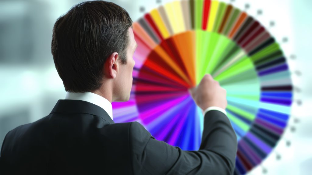
Color is more than decoration — it’s communication.
Before customers read a single word of your website or post, they’ve already formed an impression of your brand — based on color.
In fact, according to a University of Winnipeg study, up to 90% of snap judgments about products are based on color alone.
That’s right. Color can determine whether someone trusts your brand, clicks your ad, or buys your product.
So, if your brand colors feel “off,” your message — no matter how great — might never land.
Let’s explore how color choices affect how customers feel about your brand in 2025, how to use color psychology strategically, and how to align your visuals with emotion, trust, and conversion.
1. The Psychology of Color: Why It Still Matters in 2025

In a fast-moving digital world of automation and AI, emotion remains the most powerful marketing tool.
And nothing triggers emotion faster than color.
Colors influence:
- How customers perceive your personality
- What emotions your content evokes
- Whether visitors stay or bounce from your site
- How trustworthy and memorable your brand feels
Think of color as the emotional shortcut between your message and your audience’s subconscious.
Color Is the Silent Language of Branding
Every color tells a story.
Blue says “trust.”
Red says “energy.”
Green says “growth.”
Black says “luxury.”
Your brand palette is the nonverbal script your audience reads instantly — even before your logo or tagline registers.
According to Pantone Color Institute, color increases brand recognition by up to 80% and influences perception at every stage of the customer journey.
Pro Tip
Before designing anything — logo, website, or ad — define the emotion you want people to feel, not just the look you want to achieve.
Ask: “Do I want my audience to feel calm, excited, powerful, or inspired?”
Then build your color palette around that emotional goal.
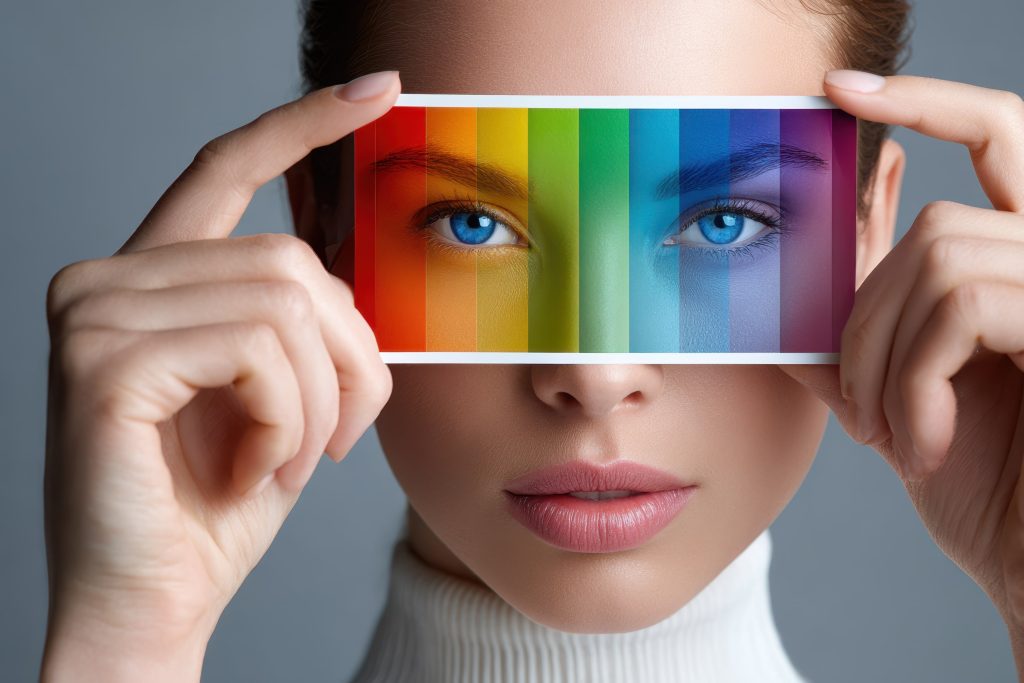
2. The Emotional Impact of Each Color (and When to Use Them)

Each color triggers a different emotional and psychological response.
Here’s how the top brand colors influence perception — and how to use them strategically.
Blue — Trust, Stability, and Security
- Used by: PayPal, LinkedIn, Chase, IBM
- Perfect for: Finance, healthcare, tech, and B2B services
Why it works:
Blue evokes confidence and dependability. It lowers stress and creates a sense of calm authority — ideal for brands that handle sensitive or important matters.
In 2025:
Deeper blues paired with neutral grays and whites dominate the digital space for a clean, reliable aesthetic.
Red — Energy, Urgency, and Passion
- Used by: Coca-Cola, Netflix, YouTube, Target
- Perfect for: Retail, entertainment, sports, and fast-moving brands
Why it works:
Red captures attention instantly and stimulates excitement and appetite. It’s ideal for calls to action (CTAs) and promotions.
In 2025:
Use red sparingly as an accent — bold enough to grab attention without overwhelming the eye.
Green — Growth, Balance, and Sustainability
- Used by: Spotify, Whole Foods, Starbucks
- Perfect for: Eco-friendly, wellness, or finance brands
Why it works:
Green is associated with health, balance, and prosperity. It suggests harmony and environmental awareness.
In 2025:
Soft sage and muted olive tones are trending — natural, authentic, and grounded.
Yellow — Optimism, Happiness, and Warmth
- Used by: McDonald’s, IKEA, Bumble
- Perfect for: Youthful, creative, or friendly brands
Why it works:
Yellow conveys optimism and approachability. It’s a mood booster that makes brands feel friendly and accessible.
In 2025:
Rich golden hues are replacing neon yellows for a more sophisticated, yet cheerful, feel.
Purple — Creativity, Wisdom, and Luxury
- Used by: Hallmark, Cadbury, Twitch
- Perfect for: Beauty, wellness, and creative industries
Why it works:
Purple combines the stability of blue with the energy of red, evoking imagination and sophistication.
In 2025:
Lavender tones and digital violets dominate design — blending spirituality and innovation.
Black — Power, Sophistication, and Minimalism
- Used by: Apple, Nike, Chanel, Tesla
- Perfect for: Luxury, tech, and high-end minimalism
Why it works:
Black communicates elegance, exclusivity, and timelessness.
In 2025:
Matte black with subtle gradients and metallic finishes are redefining premium branding.
White — Simplicity, Clarity, and Purity
- Used by: Apple, Google, Airbnb
- Perfect for: Tech, lifestyle, and design brands
Why it works:
White represents clarity and openness. It amplifies other colors and improves readability.
In 2025:
White space remains the foundation of great UX — allowing visual breathing room for minimalist aesthetics.
Orange — Enthusiasm, Confidence, and Fun
- Used by: Fanta, SoundCloud, Amazon
- Perfect for: Startups, creative industries, and eCommerce
Why it works:
Orange evokes optimism and warmth without the aggression of red.
In 2025:
Earthy terracotta and coral tones are replacing bright orange for a more mature yet energetic vibe.
Pink — Compassion, Femininity, and Modern Energy
- Used by: Barbie, Cosmopolitan, Canva
- Perfect for: Lifestyle, beauty, and personal brands
Why it works:
Pink blends empathy with creativity. It’s youthful, but when used with neutrals, it feels refined and modern.
In 2025:
Muted rose, blush, and “digital pink” (soft neon) dominate both fashion and digital branding.
Pro Tip
Mixing colors strategically builds layered emotion.
For example:
- Blue + Orange: trustworthy but friendly
- Black + Gold: luxurious and powerful
- Green + White: fresh and authentic
3. The Science of First Impressions

Color shapes how customers perceive your brand within seconds.
According to Emerald Insight Research, people form an opinion about a product in 90 seconds, and 62%–90% of that judgment is based solely on color.
This means your color palette isn’t aesthetic — it’s strategic.
How Color Affects Perception
- Warm Colors (red, orange, yellow): Energetic, stimulating, attention-grabbing
- Cool Colors (blue, green, purple): Calming, professional, reliable
- Neutral Colors (black, white, gray): Balance, sophistication, clarity
When aligned with your brand personality, color enhances recognition and trust. When misaligned, it creates cognitive dissonance — confusion that drives customers away.
Pro Tip
Audit your brand visuals annually.
Ask:
- Do our colors still represent our mission?
- Are they aligned with our audience’s emotional expectations?
- Do they feel dated or fresh?
Brand colors, like brand messaging, evolve with time.
4. Cultural and Contextual Meanings of Color

Color meanings shift across cultures and contexts — what feels trustworthy in one region might signal danger in another.
In 2025’s global digital landscape, understanding cultural perception is crucial for global brands.
| Color | Western Meaning | Eastern Meaning |
| Red | Passion, energy | Luck, prosperity |
| White | Purity, simplicity | Mourning, death |
| Yellow | Joy, optimism | Royalty, power |
| Black | Luxury, mystery | Evil, negativity |
| Green | Nature, growth | Fertility, youth |
| Blue | Trust, calm | Immortality, healing |
If your audience spans multiple regions, test color palettes for cross-cultural resonance.
5. Color and Conversion: The Marketing Impact
Color doesn’t just shape emotion — it influences behavior.
According to Kissmetrics, color can increase brand recognition by up to 80% and improve conversion rates by 24%.
How to Use Color for Conversions
- CTA Buttons
- Red or orange grabs attention.
- Green signals “go” — ideal for positive actions.
- Blue increases trust for sign-ups or demos.
- Pricing Pages
- Highlight offers in a contrasting color to direct focus.
- Email Design
- Use background colors to separate key messages and maintain readability.
- Landing Pages
- Consistent color cues guide the eye toward conversion points.
Pro Tip
Consistency across all touchpoints — website, emails, social media — reinforces your brand memory and increases click confidence.
6. Color in Digital Spaces: Accessibility and UX
In 2025, accessibility is no longer optional — it’s a design standard.
The Web Content Accessibility Guidelines (WCAG) require minimum color contrast ratios for readability.
If your color choices don’t meet contrast standards, you may lose visibility and users.
Checklist for Color Accessibility
- Maintain a contrast ratio of 4.5:1 for body text.
- Avoid red-green combinations (common for color blindness).
- Test color schemes using WebAIM Contrast Checker.
Accessibility builds inclusion — and inclusion builds trust.
7. Emotional Color Combinations That Work
The magic of branding isn’t just the individual colors — it’s the combination that creates mood and movement.
Here are proven combinations for different brand archetypes:
| Brand Personality | Color Palette | Emotional Effect |
| Trustworthy (Corporate) | Blue + Gray + White | Calm and dependable |
| Creative (Innovative) | Purple + Teal + Coral | Fresh and inspiring |
| Eco-Friendly (Natural) | Green + Beige + White | Grounded and pure |
| Luxury (Exclusive) | Black + Gold + Silver | Sophisticated and powerful |
| Friendly (Approachable) | Yellow + Navy + White | Energetic and balanced |
Pro Tip
Use color psychology in content marketing visuals — your carousel backgrounds, video overlays, and social banners should reflect the same emotional tone as your core brand palette.
8. The Role of AI in Color and Brand Design

AI tools now predict emotional responses to color — helping marketers make smarter, data-backed design choices.
Platforms like Adobe Color and Khroma use machine learning to generate palettes that match your target audience’s mood and demographics.
GoHighLevel CRM allows you to test audience engagement across different color-based campaigns — giving you measurable emotional analytics.
This fusion of AI + psychology ensures that design decisions are no longer subjective — they’re strategic.
9. How to Choose the Right Colors for Your Brand

Step 1: Define Your Brand Personality
Is your brand bold, minimalist, playful, or professional?
Use personality archetypes to guide emotion.
Step 2: Understand Your Audience
What do your customers value emotionally — safety, freedom, creativity, luxury?
Choose colors that reflect those aspirations.
Step 3: Select a Primary and Secondary Palette
- Primary: Defines your core identity.
- Secondary: Adds flexibility and contrast for marketing materials.
Step 4: Test Before Committing
A/B test your color palettes across landing pages, email headers, and social ads using GoHighLevel analytics.
Data + emotion = the perfect palette.
10. Future of Color in Branding: Dynamic and Interactive Design

In 2025, color isn’t static — it’s adaptive.
Websites and apps now feature dynamic color modes that shift based on user interaction, time of day, or emotion.
Example:
- Dark mode for comfort at night
- Warm tones during high engagement hours
- Seasonal palette changes for relatability
Adaptive color design increases retention and enhances emotional resonance.
Brands are no longer static identities — they’re living experiences.
FAQs
Q1: How many colors should a brand use?
Stick to 3–5: one primary, two secondary, and optional accent tones.
Q2: Should I change my brand colors often?
Only if your positioning, audience, or tone changes. Evolve — don’t reinvent.
Q3: How does color affect social media engagement?
Bright, contrasting colors increase thumb-stopping power. Consistency builds brand recall.
Q4: Should I test color psychology before a rebrand?
Yes. Run audience surveys or A/B tests on landing pages before committing.
Q5: Can automation tools help track emotional engagement?
Absolutely. GoHighLevel CRM can track click behavior and campaign response across different design versions.
Color isn’t just a visual choice — it’s an emotional strategy.
In 2025, the brands that stand out don’t just look beautiful — they make people feel something real.
Your color palette speaks before your words do.
It tells your audience who you are, what you value, and why they should trust you.
If you’re ready to align your brand’s visuals, strategy, and automation for maximum emotional impact, GoHighLevel CRM can help — all for less than $50/month.
From campaign design testing to automation workflows, it brings your marketing psychology full circle.
Design with emotion. Automate with intelligence. Grow with connection.
Start Optimizing Your Brand Experience